
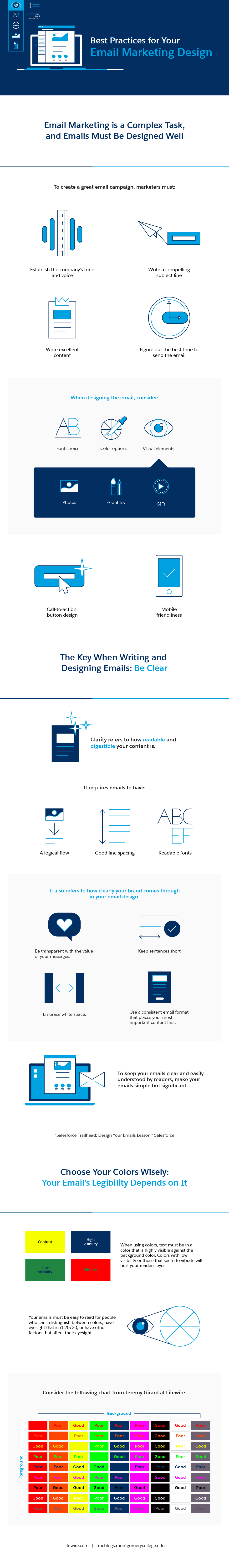
We all know how important email marketing is, but too many professionals focus entirely on the software platform, the collection of email addresses, the internal process, and the content, leaving out one crucial component — the design. And the design element may be more complex than you think.
From font choice and color options to visual elements like photos, graphics, and GIFs, the design of your email marketing tells the recipient a lot about your company and brand.
By paying close attention to the design, you can make it both readable and digestible with a logical flow and readable text that allows your brand to come through with your messaging.
And, when it comes to readability, don’t underestimate the power of color, both in terms of your font and the background, keeping in mind that not everyone has 20/20 vision or the ability to easily distinguish between certain colors. For tips on choosing the right colors, readable fonts, and more, take a look at the following graphic:
Email Marketing Infographic Source: Salesforce